It’s only logical that your software company launches a mobile-friendly version of your website. In fact, at least 50% of web traffic comes from mobile devices.“Mobile is becoming not only the new digital hub, but also the bridge to the physical world. That’s why mobile will affect more than just your digital operations – it […]
🕑 Reading Time: 9 MinutesHow can I improve SEO on my mobile site?
In today's digital age, having a mobile website is no longer a choice but a necessity for any business, especially those operating in the Software as a Service (SaaS) industry. With more than half of internet traffic coming from mobile devices, having a mobile-friendly website is critical to reach and engage with your target audience.
However, having a mobile website alone is not enough. To increase your online visibility and attract more traffic, you need to optimize your mobile website for search engines. This process is known as mobile website SEO, and it involves optimizing your site's structure, content, and other elements to improve its ranking on search engine results pages (SERPs).
Google even has a Mobile-Friendly Test that can help you check if your website is mobile-friendly. The tool checks for several factors such as text size, content width, and touch elements to ensure that your website is optimized for mobile devices.
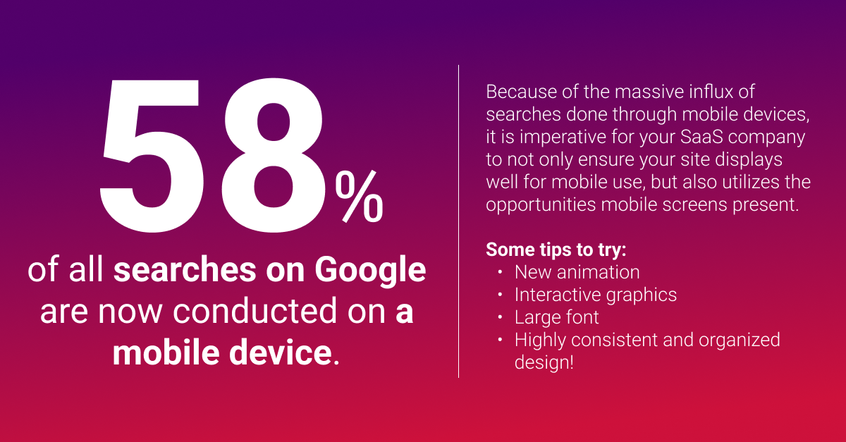
Source: Backlinko
Let's dive into some more tips to help you improve the mobile website SEO of your SaaS business:
Focus on User Experience
Google places a lot of emphasis on user experience, and this is especially true for mobile devices. A good user experience can help increase engagement and reduce bounce rates, which can positively impact your mobile website's SEO.
To improve user experience, make sure that your website has a clear and concise navigation menu, a fast loading speed, and easily accessible contact information. You should also make sure your website is easy to read and navigate on mobile devices using a responsive design.
The user experience is a key element of your SaaS mobile website. It's what determines whether or not users will engage with your website, convert into customers, and come back in the future. To improve the user experience, it is important to focus on navigation, visual appeal, and content. By providing users with a seamless experience, you can increase engagement, boost conversions, and build a loyal customer base.
Optimize Your Content
Content is king, and this is true for mobile SEO as well. To improve your mobile website's SEO, you should focus on creating high-quality and engaging content that is optimized for mobile devices.
Make sure that your content is easy to read and scan by using short paragraphs, bullet points, and headings. You should also use relevant keywords in your content to improve its visibility on search engine results pages.
No matter if your website is on a desktop or mobile device, you should still keep in mind your SaaS SEO strategy. Your mobile traffic still relies on organic search results, so narrowing down the search terms you want to target is key.
Once you start to climb the search rankings on the relevant keywords for your industry, you'll notice your website's visibility rise. As a result, you'll also attract the appropriate audience that would benefit the most from your product/service.
Here are a few ideas on how you can improve the content on your SaaS mobile website:
Use keyword-rich titles and descriptions: Use descriptive, keyword-rich titles and descriptions for your web pages to help search engines understand the context of your content.
Use internal linking: Use internal linking to connect your website pages and help search engines understand the structure of your website. Think of this as the framework/map for Google to crawl your pages effectively.
Use multimedia content: Use images, videos, and other multimedia content to make your website more engaging and visually appealing to users. At the same time, you want to test and make sure this variety of content is responding well on mobile devices. If it's not, then you need to re-work the page structure.
Optimizing your SaaS mobile website for SEO is essential for improving the visibility and ranking of your website in search engine results. By focusing on factors such as website speed, mobile responsiveness, and high-quality content, you can narrow in on who you want to reach with your content and as a result, drive more conversions.
Before you continue reading...
We've created a comprehensive guide on how SaaS companies should utilize search engine optimization for business growth.
From landing pages and API documentation to vertical industry reports and guest blogging, explore our top 9 SEO tips that software companies can put into use right away.
Use a Responsive Design
A responsive design is a design that adjusts to the size of the screen on which it is being viewed. This means that your website will look good and be easy to navigate on any device, whether it's a desktop computer, a tablet, or a smartphone.
Using a responsive design is important for mobile website SEO because it helps improve the user experience and reduces the chances of users bouncing from your website due to a poor user experience.
Here are a few of the benefits you'll yield if you ensure your website has a responsive design:
Increased Reach: By having a responsive website design, your SaaS mobile website will be accessible to a wider range of users. This is because it will be optimized for different screen sizes and devices. This means that users who are accessing your website from a smartphone, tablet, or desktop computer will all be able to view your website properly. This will increase your reach and help you to reach more potential customers.
Better SEO: Having a responsive website design can also improve your SEO. This is because Google and other search engines prefer websites that are mobile-friendly and responsive. By having a responsive website design, your website is more likely to rank higher in search engine results pages, which can help you to attract more traffic to your website.
Cost-effective: Having a responsive website design is also cost-effective. This is because you only need to maintain one website that is optimized for different screen sizes and devices. This means that you don't have to create multiple websites for different devices, which can be costly and time-consuming.
Improved website speed: A responsive website design can also help to improve the speed of your website. This is because it eliminates the need for separate mobile and desktop websites, which can slow down your website's loading time. With a responsive website design, your website will load quickly on any device, which can improve the user experience and boost your SEO. In fact, Google says that 53% of website visits are abandoned if the page takes more than 3 seconds to load.
- Decreased bounce rate: By focusing on a responsive design that caters to the user experience, you'll easily reduce the bounce rate on your SaaS website.
Use Schema Markup
Schema markup is a type of structured data that helps search engines understand the content on your website. By using schema markup, you can provide search engines with more information about your website's content, which can help improve its visibility on search engine results pages.
Some common types of schema markup that you can use on your mobile website include product schema, review schema, and breadcrumb schema.
In conclusion, mobile website SEO is critical for SaaS businesses that want to improve their online visibility and attract more traffic. By optimizing your mobile website for search engines, you can improve the user experience, increase engagement, and drive more traffic to your website. Use the tips above to get started with optimizing your mobile website for SEO today.
Utilizing structured data can help mobile users in a variety of ways, including:
- Improved search engine visibility: Structured data can help to improve the visibility of your website in search engine results pages. This data provides search engines with additional information about the content on your website.
- Rich snippets: Structured data can also help to generate rich snippets in search engine results pages. Rich snippets provide additional information about your website's content, such as reviews, ratings, and product information. This improves the click-through rate of your website in SERP results.
- Voice search optimization: Structured data can also help to optimize your website for voice search. With the rise of voice assistants like Siri and Alexa, more and more people are using voice search to find information online.
- Competitive advantage: Implementing structured data can give you a competitive advantage over other SaaS companies that have not yet implemented structured data on their websites. By providing search engines with additional information about your content, you can improve the visibility of your website in search engine results pages and attract more traffic to your website.
Avoid Using a Ton of Images
While images can be visually appealing and enhance the user experience, using too many images can have a negative impact on your website's performance and SEO.
One of the main concerns with using too many images on a mobile website is the effect it has on page loading speed. Mobile users expect a fast-loading website, and if your site takes too long to load, it can lead to a high bounce rate, which can negatively impact your SEO. Large images can slow down your website, especially if they are not optimized for mobile devices.
Additionally, using too many images can make your website cluttered and difficult to navigate, especially on smaller screens. It can also detract from your website's overall message and make it harder for users to find the information they need.
Sometimes incorporating white space can be just as effective as including graphics/images. Giving your content white space and room to breathe can actually improve comprehension by as much as 20%. You can also execute this by breaking up your paragraphs and overall making sure your content is scannable. Long paragraphs in an article tend to be offputting and intimidating for visitors to read all the way through. SEMrush gives a perfect example of breaking up your content to make it more readable:

However, this doesn't mean that you should avoid using images altogether. Images can be a powerful tool for engaging users and conveying information. The key is to use them strategically and sparingly. Here are some quick tips for using images effectively on your SaaS website:
- Use high-quality images that are optimized for mobile devices. This will ensure that your images load quickly and look great on any device.
- Use images to enhance your content and make it more engaging. For example, you could use images to illustrate key points, break up long blocks of text, or add visual interest to your site.
- Use images strategically to draw attention to important information. For example, you could use an image to highlight a call to action or draw attention to a particular feature of your product.
- Avoid using too many images on a single page. Instead, use images sparingly and strategically to avoid overwhelming the user.
- Keep in mind that you want to have a responsive design to ensure that your images are displayed correctly on any device. This will help to enhance the user experience and improve your website's SEO.
Don't Use Flash or Pop-Ups
Flash has long been used to create interactive and immersive visual experiences on websites, but as time goes on more and more browsers are eliminating the need for it. Without Flash installed, users simply won’t be able to see the content created with Flash plugins, leaving a blank space in its place. Therefore, developers shouldn’t rely strictly on Flash for their content if they want maximum accessibility for their website or product.
Instead of using Flash, developers should use HTML5 which enables cross-platform access and better support from mobile devices. HTML5 allows developers to include animation elements, audio and video content, data storage capabilities, and geolocation capabilities on any platform. You can do this all without needing a plugin or special download. Additionally, search engine optimization is much easier when using HTML5. Overall the more supported formats help website rankings when included in webpages. There are plenty of tools available that give users just as much control over effects as before with Flash. So it is crucial to update your code so that you can support all visitors including mobile users.
Fix Any Link Errors
Ensuring that your website’s design is properly optimized for mobile devices involves more than just creating a visually appealing structure. In addition to making sure that page elements are sized correctly and loading quickly, it is important to eliminate any faulty redirects or cross-links. If you run regular health checks and remove crawl problems, the chances of success in search engine rankings increase drastically.
Removing faulty redirects or cross-links improves natural search results by helping Google index content properly and enabling an optimized automatic discovery of pages. Particularly, the linkable element needs to point to the correct location with minimal server latency. Since redirects accumulate over time due to new content being added, it is recommended that regular website checks be conducted in order to ensure fast responses and optimize overall performance.
The increase in organic traffic resulting from high rankings on Google’s search engine result page far outweighs the initial effort associated with proper redirection management. Don't push aside your frequent site audits and make sure you are always looking for any errors or faulty links that could do harm to your website performance.
Key Takeaways
In today's fast-paced and increasingly mobile world, optimizing your SaaS website for mobile devices is essential for the success of your business. A mobile-friendly website can improve user experience, increase engagement, and drive more traffic to your site. However, it's important to remember that simply having a mobile website is not enough. You also need to ensure that your website is optimized for search engines and provides high-quality, relevant content to your users.
To achieve this, there are several key factors to consider, including website speed, mobile responsiveness, structured data, and high-quality content. By focusing on these factors, you can improve the visibility and ranking of your website in search engine results pages, and provide a better user experience for your customers.
In summary, optimizing your SaaS mobile website is not only important, but it's also essential for the success of your business. By implementing the strategies and tips discussed in this article, you can improve your website's performance and provide a better experience for your users and ultimately drive more traffic and conversions for your business.
It's time to scale your software, technology or device business.
One quick call and we'll share our approach - no pressure.
Talk with us