10 Principles for SaaS Website Conversion
Selling software requires a specialized approach to reach, convert, and retain customers. The funnel for growth of SaaS companies goes through awareness, engagement, conversion, closing, and retention.
Central to this funnel is your website which includes engagement and conversion specifically.
Your website consists of engagement and conversion, and traffic to a bad site is wasted time and money!
Closing and retention can’t happen if you don’t engage and convert; and SaaS website conversion strategy must be your new priority.
Imagine averaging 1000 weekly visitors to your site that leads to a 2% conversion rate. That means that your site is getting 20 trials, likely closing 20%, which is around four customers, but only retaining 50% of those four customers, meaning you’re ending with only two out of the initial thousand visitors.
Studies show that 7% is often an average conversion rate for SaaS websites; obtaining over 5% is considered good, but we want you to push for more.
Before putting money and time into awareness, make sure that your website conversion is optimized to get the most out of your effort.
On the opposite side, if our conversion isn’t working we can’t turn trials into sales or retain accounts.
Take a look through Insivia’s 10 principles for killer conversion optimization of SaaS websites:
1. It has to be convincing, easy to scan and digestible.
People in our day and age do not like to read. You must make content scannable for your audience, no matter how high-level they may be. There’s a massive misconception that writing long-form content or designing pages with heavy text means that it should be filled with jargon, and twenty-dollar words.
The reality is, making content scannable is really straightforward, most often about design, and will increase your SaaS website conversion rates.
Utilize the natural hierarchy of a site.
Your most important points and key messaging should be the first impression your visitors get.
Play with multiple font types and sizes.
While everything on your site should stay consistent and brand, it doesn’t mean that you cannot have some fun when it comes to designing scannable content.
This can even include utilizing different font weights and manipulating your brand color palette to emphasize important information.
Keep it simple.
Bullet point lists make disseminating information extremely digestible and perfect for scanning.
Stay away from fluff.
Avoid filler words and get your point fast.
Impose, clear action, that hints at the purpose of a destination.
It’s vital to remember that this is a part of your customer journey, so pushing a call to action or any type of direction, will not only increase the helpfulness and reliability of the ways in which your site is communicating information, but it will also feel supportive to a visitor.
Ensure that links include information, bearing words
Instead of using generic “go”, “click here”, “more”, etc. make use of your brand voice. This technique improves accessibility for users, who hear links read out loud instead of visually, and it pushes your brand in a positive direction that sets you apart from competitors.
EXAMPLE
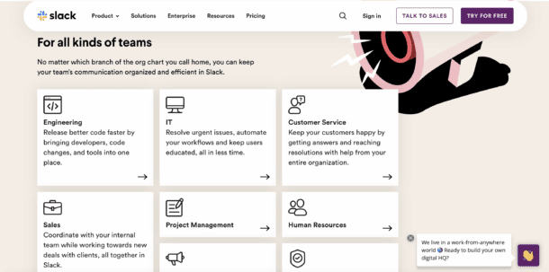
Broken up text, clear intention and direction for clicks, use of imagery, customizable customer journey (i.e. PMs, HR)
2. Always have multiple conversion actions.
Most SaaS site visitors are not ready to buy. Researchers want to learn more, providing a great opportunity for a webinar or a demo. Buyers want to talk or need someone to work with which means they need access to contact forms, phone numbers, purchasing options, etc. But for the most part, browsers are not ready to buy, this is where you offer to download information, a report, an e-book, a guide, or subscribe to a newsletter to help them stay in touch.
It is crucial to leverage multiple conversions, at different points in the buying cycle.
Newsletters and downloads are low commitment. Whereas webinars and tools are mid-level conversions. Lastly, high commitment conversions include trials and demos. Providing options will benefit your audience by not limiting what they can do or how they can stay in touch, and instead will increase your SaaS website conversion rates.
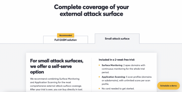
3. Pricing pages are a science and should be treated that way.
Key pricing page elements:
- Positioning statement to summarize benefits and unique value propositions.
- Clarity to establish trust and clarity such as ‘30 Day Free Trial’, ‘Free Forever’, ‘Demo’, etc.
- Simple pricing to ensure clarity about what the short-term and long-term costs will be.
- Validation to provide confidence in moving forward with quotes, ratings, awards, or client logos.
- Answer common questions to remove barriers for conversion; like refund policy, data protection, hidden fees, etc.
An alternative conversion to capture visitors that are early in the buying cycle and not ready to buy yet: whitepaper, comparison chart, webinar.
Make a page clean and beautiful
Your pricing page, and website as a whole, should represent the experience people have using your product. If the layout, messaging, and pricing model are not easy to understand, or your interface is not polished, then visitors assume that is what your product will look like. This common mistake significantly reduces conversions for too many SaaS websites.
EXAMPLES
Box makes every option incredibly clear. What is most important? Communicating price options.
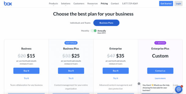
Well, what exactly do each of these mean? What the best option for me? Box answers!
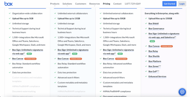
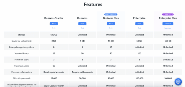
Need even more information? Here is a features matrix…
Detectify wants to be straightforward and simple with their design. While Box attempts to answer any question a visitor might have, Detectify takes a lighter approach.
Detectify is informative and interactive; notice the intention of pricing communication with the requirement of a scroll.
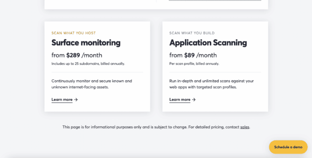
They also include testimonials, pushing the validation of their service.
Consistency is key, continue to utilize your brand tone, voice, and style to best communicate coherence.
4. Always have great screenshots and a tour.
Maintaining accessibility on your site at all times, from every corner, is vital. Almost 100% of visitors need to see what your product looks like in order to convert. Can you imagine ever buying a product without actually seeing it yourself? Your website must include pictures of your software that depict interaction and experience. Studies show that a lack of enough screenshots of a SaaS product decrease conversion rate significantly.
EXAMPLE
Tips:
- Don’t be stingy.
Don’t keep your product too close to your chest. Show lots of screenshots, interactions, etc. and have a product tour for visitors to explore. - Keep them organized.
Part of your approach to site architecture should be organization. Make things easy to find and frequently asked questions simply answered. The feature the visitor is most interested in. Should be hyper accessible. - Leverage animation.
Don’t be static, be dynamic. GIF images and auto play video can easily show how a specific feature works or how a user would interact with a certain feature. - User experience.
Do not leave it to the developers. Your user experience has to be amazing to compete. Not only should it be beautiful, organized, accessible, digestible, but it should set your solution apart from your competitors.
5. Provide scroll hints to increase… well… scrolling.
Subtle hints can increase scrolling significantly. Visually, entire sites cannot fit on a web screen let alone a mobile device. By making simple design changes to your site, you can encourage users to continue exploring your site without running into the possibility that a visitor thinks you communicated all you can.
Drive the visitor journey with scroll, heads and actions. This could include call to action, signaling like “explore our XYZ” or even simply designing your navigation to entice clicks.
Focused Path Design
Few actions and minimal scroll signals funnels most visitors into a single primary next step
Open Browsing Design
Five or more actions, some even repeated, give a visitor a lot of options, but also reduces your control of their journey.
Maintaining consistency and an ease of flow will increase generalized trust toward your site. We’ve all been on a site and gotten lost or frustrated and just bounced; so guiding users will inevitably encourage a boost in SaaS website conversions.
6. Use consistency and predictability for a better user experience.
Predictability and consistency significantly increase time on your SaaS site, comprehension, and conversion. If the roads moved and signs changed everyday on your way to work, you’d hate your commute…you probably do even when it is consistent and clearly understood.
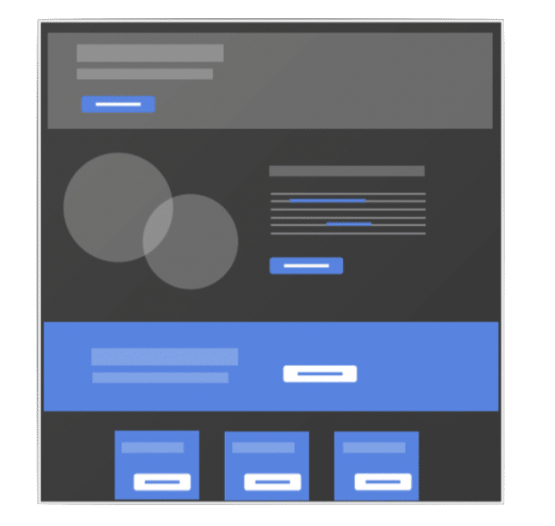
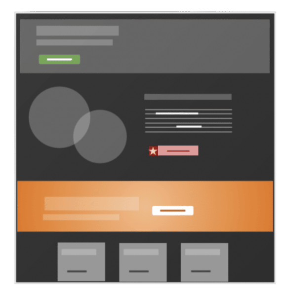
EXAMPLES
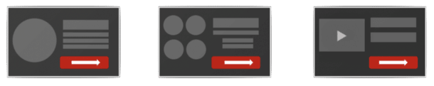 Keep things simple to maintain consistency… In the above example, we see separate web pages with the same design indicating where to click or move forward. In the example below we see three separate web pages with completely different designs to indicate where to click or move forward. Designing with the latter perspective can lead to confusion and eventual exiting without conversion.
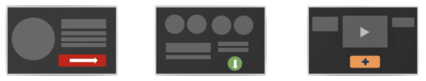
Use color and shape to categorize content and create predictability across your site. Designing with consistency is key, but building familiarity for users is even more important.
How to create predictability:
- All actions follow one color scheme
- All buttons maintain the same style
- Headlines keep consistent sizes
- Visitor can learn quickly and scan content
7. Keep forms simple. SaaS website conversion doesn’t need complication!
You’d rather they get completed than that extra field filled out.
Make it as easy for visitors to contact, register, download, sign-up, or buy! Additionally, make your intentions with the form very clear; what happens after filling out the form, what can a user expect?
Follow these rules of thumb for forms to increase conversions:
- Design with one column that moves straight down the page.
- Eliminate distracting words in labels.
- Keep the questions short and to the point.
- Remove unnecessary questions… is it something that could be answered later?
- Ensure supporting content remains viewable.
- Make labels clear and simple for what people need to fill out.
- If placeholders are the only labels, have functionality to move them to display while typing. People forget what they are filling out and will leave the form
- Have text that entices completion and the value received from completion in close proximity to the form.
- Have a clear and bold submission button that is in the line of sight of the last field.
- Avoid dropdowns or other complicated fields when possible
- If you have validation, do not over validate to stop visitors from being able to complete.
8. Images are science more than art.
EXAMPLES
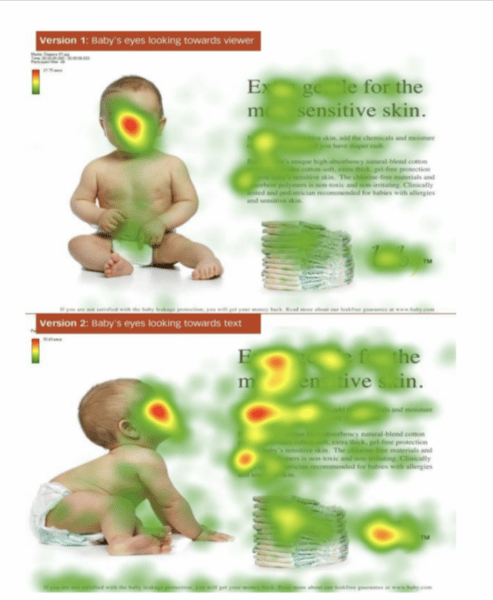
In the top example, the visitor is focused on the wrong thing. This is because human psychology is drawn to eyes and our attention is centered on the image instead of the content itself. Whereas, in the bottom example, the visitor is drawn to the content and CTAs. Our eyes naturally look where someone else does. Use imagery to guide how and what users view.
Too often images can be ineffective and lead to less conversions because of what it is focused on. Rather than focusing on one sole subject, images can provide support to whatever the message may be. The Obama campaign tested this theory and found that using an image of President Barack Obama smiling at a table with a diverse crowd received a 20% higher conversion rate.
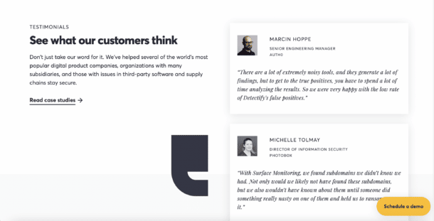
9. Validation is a key element for website conversion that must be presented at the right times.
Validation is all about increasing confidence. Think about it as a point system…
- Site is professional and easy to use = 5 pts.
- Users can watch a video of a customer recommendation = 10 pts.
- User recognizes a client logo of a brand they respect and trust = 5 pts.
- Site displays awards and PR on the brand = 5 pts.
Validation is also about reducing risk. You’re either racking up those points or you are losing them.
- Site presents no trial information or opportunity = -10 pts
- Users can’t find any testimonials or logos, why should they trust you? = -5pts
- No contact pages or information = -5 pts
- Site has no previews on product = -10 pts
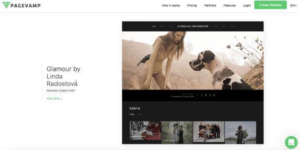
How you present validation can be very unique. For example, PageVamp utilizes their own customers’ pages as validation. Essentially, they’re saying, look at how we’ve benefited other customers rather than only reading a quote from a client.
Use validation at the right time to increase conversion. They key to validation is matching the type of validation and message with the user’s point in their buying cycle, which is often determined by their journey.
10. Search optimization is a journey not a destination
The key to maintaining positive SEO stats has to do with quality and relevancy.
Quality
There are particular signals that tell Google what is valuable to searchers, so increasing the quality of your content is crucial.
Quality includes depth and dedication toward what content your site is producing. Include high-value media and inbound and outbound links as reliable sources (Google loves this). Track what makes visitors bounce and incite change across old and new content. Ensure your socials are available and give opportunities to easily share or distribute an article, video, etc. Site speed is incredibly important, so if that means you need to make a shift to what tech your company uses, advocate for it.
Relevancy
In addition to quality signals, Google senses what matches exactly what a searcher is looking for. This is done through what is written in the content itself.
Strategically focus on the following:
- Key phrase focus
- Key phrase hierarchy
- Outbound link topic
- Site focus
- URL structure
- Title & meta description/ data
- Inbound link topic
Other Must Do’s:
301 Redirects: When a URL changes, always have a redirect.
XML Sitemaps: Submit your content architecture to Google.
Code Minification: Optimize your code for download.
Image Optimization: Make sure images are light.
Content Marketing: Create really valuable content.
Social Sharing: Let others share easily and share your own content too.
SEO & User Experience Are A Balancing Act.
Search optimization includes pages that have a very specific focus. You want to have pages with narrow topics for a targeted audience that focuses on a specific key phrase.
User experience can easily get ruined at any stage of the visitor’s journey. If there is too much content on your site, the user will get overwhelmed. You want to consolidate pages for a better overall user experience. (And, this helps SEO efforts as well)
Next Steps
Use these principles to evaluate your site! If it feels overwhelming, make use of our web experts to assess your site’s user experience, conversion, and SEO to identify opportunities for improvement.
One of the key factors to driving growth is getting conversion right – it’s so imperative that we have developed an eBook dedicated to increasing conversion for SaaS sites.
Better yet, build a web strategy, and even let Insivia do it for you. If you feel ready for a redesign, reach out to the Insivia team to create a smart web strategy for your site.

Written by: Tony Zayas, Chief Revenue Officer
In my role as Chief Revenue Officer at Insivia, I help SaaS and technology companies break through growth ceilings by aligning their marketing, sales, and positioning around one central truth: buyers drive everything.
I lead our go-to-market strategy and revenue operations, working with founders and teams to sharpen their message, accelerate demand, and remove friction across the entire buyer journey.
With years of experience collaborating with fast-growth companies, I focus on turning deep buyer understanding into predictable, scalable revenue—because real growth happens when every motion reflects what the buyer actually needs, expects, and believes.