7 Ways to Make Your CTA Work for You
In a previous post, we discussed Why Your Website Is the Center of Your Marketing Strategy, and as such your website should be capturing leads on a steady basis. If it’s not, why? Most likely it’s because you aren’t asking a lead to take an action or you aren’t providing the lead with a compelling enough reason to provide their contact information.
Imagine yourself as a visitor who just landed on your company’s website for the first time through organic search. When the page opens, ask yourself these types of questions: What is the page content telling the lead to do? Where should they go? Are they getting everything they need on the page or do they need to navigate away? How do you want them to take action?
A CTA, or call-to-action, is the key to guiding a visitor or prospect through the buying journey with your company. And the call-to-action needs to be strategic and compelling enough entice the visitor to submit the action on the spot. Here are 7 key tips to having effective calls-to-action on your website and increasing your conversion rate.
- Determine your primary and secondary calls-to-action. What is the key action you want the visitors to take that will drop them into your marketing funnel? Sign up for a free trial, download an ebook, register for a webinar, etc. Then, what is the second option they could go for: sign up for your enewsletter, request a consultation, schedule a demo, etc.

- Add strong CTAs in all pieces of content on your site.Tell your visitors exactly what you want them to do next, whether it’s read an article post, click a button, or fill out a form.
- Keep it simple. The less fields in a form the better, such as just name and email. And if you need to have additional input fields in the form, keep as many optional as possible.

- Place your primary CTA conversion point above the fold. Keep the opt-in box in the top portion of your webpage so the visitor sees it clearly.
- Add urgency to the CTA offer. Use timing words such as “today,” “get started,” or “now” to create a sense of urgency and drive the visitor to take action on the spot. Or take it one step further with an offer deadline.

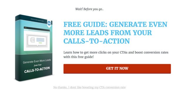
- Include a clear value proposition. How is what you are offering the visitor different, better, or more compelling than similar offers in the marketplace? Why should they opt-in for this offer right now? Start with a clear title, provide a quick compelling description of what they will get when they submit, and how they will be able to use it or benefit from it.
- Be sure your CTA button looks clickable. Clear, distinct, rectangular or rounded shape, with crisp contrasting font and background colors. Use short, actionable words on the button that are relevant to your visitors.
Finally, test, test, and retest. An effective call-to-action is not a ‘set it and forget it’ element. Review the analytics of your website pages, paying attention to what your visitors are looking at on your site, what actions they are taking, and where they are bouncing off. Test out changing the placement of your CTA, the words you are using, the color and language of the button, size and placement of the button, etc.
Remember, make only one change a time and wait at least a couple of weeks to see results. If you change more than one element around your call-to-action at a time, you will be unable to know which change made the difference.
Written by: Tony Zayas, Chief Revenue Officer
In my role as Chief Revenue Officer at Insivia, I help SaaS and technology companies break through growth ceilings by aligning their marketing, sales, and positioning around one central truth: buyers drive everything.
I lead our go-to-market strategy and revenue operations, working with founders and teams to sharpen their message, accelerate demand, and remove friction across the entire buyer journey.
With years of experience collaborating with fast-growth companies, I focus on turning deep buyer understanding into predictable, scalable revenue—because real growth happens when every motion reflects what the buyer actually needs, expects, and believes.
