Micro Case Study: How Mega Menus Increase Site Performance
Why are mega-menus the right design choice?
- Efficient Navigation : SaaS websites often offer a wide range of features, solutions, and content. Mega menus provide a clear and efficient way to organize and present these options to users. They allow you to display a large amount of information in a structured and easily accessible format, making it easier for visitors to find what they need quickly.
- Improved User Experience : Mega menus enhance the overall user experience by reducing the number of clicks required to access specific sections or features of a SaaS platform. Users appreciate websites that make it easy for them to navigate and find the information they’re looking for, and mega menus can help achieve this.
- Categorization and Hierarchy : SaaS platforms often have complex structures with multiple layers of information. Mega menus enable you to categorize content and display it hierarchically. This helps users understand the relationships between different sections and features, which can be especially beneficial for new users who are learning how to use the service.
- Promotion of Key Features : Mega menus allow you to highlight important or popular features prominently. This can be helpful for driving user engagement and showcasing the unique selling points of your SaaS product. By featuring these prominently in the mega menu, you increase the likelihood that users will explore and utilize these features.
- Responsive Design : Many mega menu implementations are designed to be responsive, ensuring they work well on both desktop and mobile devices. This adaptability is crucial for SaaS websites, as users access these platforms from various devices. Responsive mega menus can collapse into a mobile-friendly version, preserving the user experience on smaller screens.
- Visual Appeal : Well-designed mega menus can also enhance the visual appeal of a SaaS website. They offer opportunities for branding, including colors, typography, and imagery, which can reinforce your brand identity and create a visually appealing user interface.
- Reduced Clutter : Mega menus help prevent clutter on your homepage or landing pages. Instead of crowding your main page with numerous links or buttons, you can neatly organize them within the mega menu. This clean and organized layout can make a positive impression on users and convey a sense of professionalism.
- Accessibility : When implemented correctly, mega menus can be made accessible to users with disabilities, ensuring that all users, regardless of their abilities, can easily navigate your SaaS website.
- Analytics and Insights : Mega menus can provide valuable data on user behavior and preferences. By tracking which menu items are clicked on the most, you can gain insights into what users are interested in and use this information to improve your website’s content and user experience.
Begin designing mega menus:
Challenges
What do mega menus solve and what challenges do you might not even know exist on your site?
- Cluttered Navigation : Without mega menus, websites often resort to traditional navigation bars or sidebars. This can lead to a cluttered and overwhelming appearance, especially for SaaS websites with a vast array of features and content. Users may struggle to find what they’re looking for amid a sea of links.
- Increased Click Depth : Mega menus allow for the display of multiple navigation options at once. Without them, users may need to click through several layers of submenus or pages to reach their desired destination. This increased click depth can frustrate users and make navigation time-consuming.
- Limited Space for Promotion : SaaS websites often need to promote key features or highlight important information. Mega menus provide space for such promotional content, but without them, this content may be buried deeper within the site, reducing its visibility and impact.
- Mobile Usability Issues : On mobile devices, traditional navigation menus can become problematic due to limited screen space. Users may have to scroll extensively to access navigation options, which is far less efficient than the compact, collapsible mega menus designed for mobile responsiveness.
- Poor User Engagement : Cumbersome navigation can lead to reduced user engagement. If users struggle to find what they need quickly, they may become frustrated and leave the site, resulting in lost opportunities for conversions or interactions.
- Inefficient Information Hierarchy : Mega menus allow for clear categorization and hierarchy of content. Without them, information may be presented in a less organized manner, making it difficult for users to grasp the relationships between different sections and features.
Define your target audience personas using AI with Frictionless.
Effective marketing and sales rely on knowing your audience inside and out. Leverage our free AI persona builder to get an unbiased view of your targets.
Strategy
The Insivia approach is to, before anything, create strategic design.
Why a Mega Menu is Ideal:
- Allows the full use of horizontal space on desktop for extra explanatory content.
- Enhances the visual aesthetic of the website.
- Provides space for descriptions of pages that users can read before clicking, improving user understanding.
Why a Mega Menu Was Right for EsquireTek:
- Contributes to a good visual aesthetic.
- Allows users to read page descriptions to better understand which page they want to visit.
- Facilitates categorization of various elements, including features, audience pages, and blogs.
Issues with the Previous “Drop Downs”:
- Lack of descriptions for pages, only displaying page titles.
- Less visually appealing compared to mega menus.
Mega Menu Structure:
- The menu content is structured in a box format.
- Consistent left-side overview explanations accompany each menu item to provide context.
- Utilizes a grid layout for neatly organizing menu content.
- Follows basic text hierarchy with headers, paragraphs, and calls-to-action.
- Uses hover effects to clearly indicate to users which menu item they are about to click on.
Challenges with the Old Structure:
- No descriptions of the pages, leading to potential user confusion.
- Less visually appealing compared to the new mega menu.
- Efficiency in grouping was a concern, although the interviewee is not entirely sure as the old site has been replaced with the new one.
Before you continue reading…
You can also explore our Brand Positioning Audit Guide.
There are two things required to reach a destination – first to know where you want to go, but second to also know where you stand today. It’s true, if we asked Google maps to direct us to Pittsburgh, but it had no idea where we were then it could not show us the path we need to take.
Mega Menus for EsquireTek
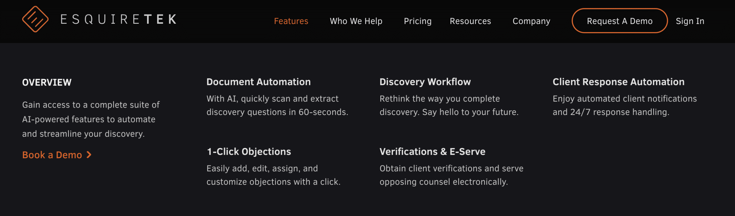
Features mega menu drop down for EsquireTek with an opportunity for strategic CTAs.

Utilizing design space for CTA consistency.
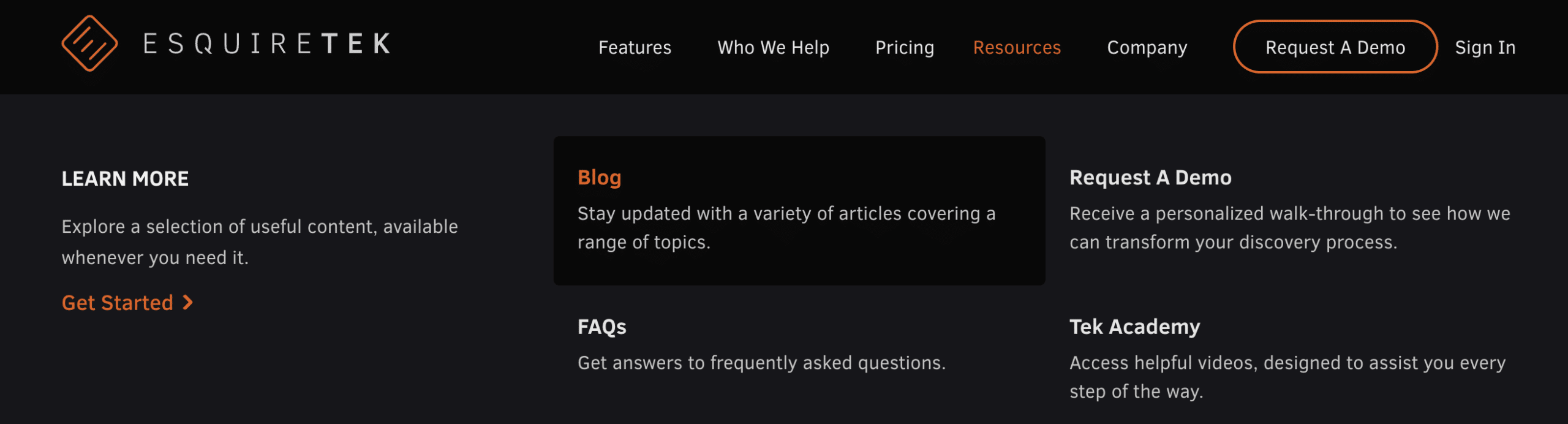
Hover over interaction and design; additional CTA opportunity beyond repetitive verbiage.

Written by: Tony Zayas, Chief Revenue Officer
In my role as Chief Revenue Officer at Insivia, I help SaaS and technology companies break through growth ceilings by aligning their marketing, sales, and positioning around one central truth: buyers drive everything.
I lead our go-to-market strategy and revenue operations, working with founders and teams to sharpen their message, accelerate demand, and remove friction across the entire buyer journey.
With years of experience collaborating with fast-growth companies, I focus on turning deep buyer understanding into predictable, scalable revenue—because real growth happens when every motion reflects what the buyer actually needs, expects, and believes.