13 Mistakes in SaaS Website Design
Effective SaaS website design goes beyond merely showcasing the features of the software. It serves as a powerful marketing tool, a customer support channel, and a lead generation platform.
A compelling SaaS website can significantly impact the success of the entire business, while a poorly executed one can lead to missed opportunities and lost revenue.
We’re going to shed light on 13 common mistakes that SaaS website owners often overlook. By identifying these pitfalls, you’ll gain a deeper understanding of potential areas of improvement for your website.
Mistake 1: Lack of a Clear Value Proposition
A value proposition is a concise statement that communicates the unique benefits a product or service offers to its target audience. It serves as the foundation of a SaaS website’s messaging, conveying why users should choose your particular solution over others.
Having a strong value proposition on the website is vital for several reasons:
- Differentiation: With numerous SaaS products available, a well-crafted value proposition sets a brand apart from competitors. It highlights the unique selling points that make the product stand out in a crowded marketplace.
- User Engagement: A compelling value proposition captivates visitors from the moment they land on the website. It immediately addresses their pain points and needs, encouraging them to explore further.
- Clarity and Focus: A clear value proposition ensures that both potential customers and the SaaS company itself have a crystal-clear understanding of the product’s purpose and benefits.
- Conversion Driver: Strong value propositions motivate visitors to take the desired action, whether it’s signing up for a free trial, subscribing to a plan, or contacting sales.
How to craft an effective value proposition:
Crafting an effective value proposition requires a deep understanding of the target audience, their pain points, and the unique benefits the SaaS product offers. Here are some steps to guide you in creating a compelling value proposition:
- Identify Target Audience: Clearly define the target audience and understand their needs, preferences, and pain points. Tailor the value proposition to resonate with their specific challenges.
- Focus on Benefits: Instead of merely listing features, emphasize the benefits the product brings to users’ lives or businesses. How does it solve their problems or make their lives easier?
- Keep It Concise: Aim to communicate the essence of the product in a sentence or two. Maintain brevity and purpose with your statements.
- Be Clear & Specific: Avoid vague or generic language. Be specific about what the product does and what sets it apart.
- Use Strong Messaging: Employ persuasive language that evokes emotion and captures the visitor’s attention.
- Test & Iterate: Test different value propositions with real users to see which resonates best. Iterate and refine based on feedback and data.
Mistake 2: Complex Navigation
When navigation is overly complex it can lead to frustration and confusion, ultimately driving users away from your site. However, a well-organized and user-friendly navigation system can enhance engagement, leading to higher conversion rates and improved customer satisfaction.
Common navigation & UX SaaS website design mistakes to avoid:
- Overcomplicated Menus: Having too many menu options or nested submenus can overwhelm visitors and make it difficult for them to locate relevant information.
- Unclear Labels: Using vague or jargon-heavy labels for navigation links can confuse users and hinder their understanding of what each section contains.
- Lack of Visual Cues: Failing to provide clear visual cues, such as highlighting the active menu item or using breadcrumbs, can disorient users and lead to frustration.
- Non-Responsive Design: Neglecting to make navigation mobile-friendly can result in a poor user experience on smartphones and tablets, leading to a high bounce rate on mobile devices. Over 50% of website visitors are less likely to engage with sites with bad mobile-friendly website designs.
- Inconsistent Layout: Inconsistent navigation elements across different pages can create a disjointed user experience and make it challenging for users to find their way around.
Best practices for improving website usability:
- Simplify Menu Structure: Streamline the navigation menu by categorizing content logically and reducing the number of menu items. Aim for a maximum of seven menu options for optimal clarity.
- Clear & Descriptive Labels: Use straightforward and descriptive labels for navigation links, enabling users to quickly understand what each section offers.
- Visual Cues & Feedback: Implement visual cues, such as changing the color or style of active menu items, and provide clear feedback when users perform actions like form submissions or button clicks.
- Responsive Design: Ensure that the website’s navigation is fully responsive and adapts seamlessly to different screen sizes and devices.
- Consistent Layout: Maintain consistency in the placement and design of navigation elements throughout the website to create a cohesive and familiar user experience.
Mistake 3: Neglecting Mobile Responsiveness
Mobile users make up half of all internet visits, making mobile devices a primary channel of accessing the internet for a significant portion of the population.
If you neglect mobile optimization in your SaaS website design, your business will experience the following severe consequences:
- High Bounce Rates: Non-responsive websites can be challenging to navigate on mobile devices, leading to high bounce rates as frustrated users quickly leave the site.
- Decreased Conversions: Difficult-to-use forms and checkout processes on mobile can result in decreased conversion rates, impacting revenue generation.
- Damaged Reputation: A poor mobile experience reflects poorly on the brand and can damage the website’s credibility and reputation.
- SEO Ranking: Search engines penalize non-responsive websites by ranking them lower in search results. This naturally reduces organic traffic and potential customer reach.
Here are some tips and tricks for maintaining a well-optimized mobile website:
- Optimize Loading Times: Compress images, minimize HTTP requests, and leverage caching to improve mobile page loading times and reduce bounce rates.
- Streamline Navigation: Simplify the navigation menu for mobile users, using collapsible menus or a hamburger icon, to make it easy for them to find what they need.
- Prioritize Content: Focus on essential content and key call-to-action buttons for mobile users, presenting information in a concise and easily scannable format.
- Test & QA Across Devices: Test your website across different mobile devices and operating systems to ensure consistent quality assurance.
- Touch-Friendly Elements: Design buttons and form fields with touch-friendly sizes to facilitate easy interaction on touchscreen devices.
- Optimize Forms: Streamline and simplify forms for mobile users, reducing the number of required fields and using mobile-friendly input types.
- Monitor Performance: Regularly monitor your website’s mobile performance and user behavior using analytics tools to identify areas for improvement.
Mistake 4: Confusing Pricing Pages
Your SaaS pricing page is undoubtedly one of the most important pages for your website. In fact, 98% of SaaS businesses earned positive results from making core changes to their pricing policy. This is where the potential customer will evaluate your pricing packages to decide whether or not they want to do business with you.
Here are some common mistakes when it comes to building a pricing page:
- Hidden Costs: Concealing fees or additional charges until the checkout process can lead to a negative customer experience and decrease trust in the brand.
- Overwhelming Information: Presenting too many pricing tiers or complex features in a cluttered manner can confuse users and make it challenging for them to choose a plan.
- Lack of Clarity: Using vague pricing descriptions or ambiguous terminology can leave customers uncertain about what they are paying for and what they will receive.
- Limited Contact Options: Failing to provide easy access to customer support or contact information can deter potential customers from seeking clarification about pricing details.
Here are some tips for improving your pricing page to drive more conversions:
- Clear Pricing Breakdown: Provide a clear breakdown of the pricing, outlining the features and benefits of each plan. Highlight the differences between tiers to help users understand the value proposition.
- Avoid Jargon: Use simple and easily understandable language to describe pricing options and avoid using technical jargon that might confuse potential entry-level customers.
- Offer a Free Trial or Demo: Providing a free trial or demo allows customers to experience the service before committing to a plan, increasing their confidence in the purchase decision.
- Upsell with Caution: When you offer add-ons or upsells, ensure that they are relevant to the user’s needs and presented in a non-intrusive manner. You don’t want to annoy the customer and make them feel like you’re just trying to get more money out of them.
- Display Customer Testimonials: Including testimonials from satisfied customers who have benefited from the different plans can add credibility and influence potential customers’ decisions. Social proof is the best support you can receive for your SaaS business.
- Implement Live Chat Support: Adding a live chat feature on the pricing page can allow customers to ask questions in real time, reducing any doubts they may have about the pricing.
Mistake 5: Ignoring Call-to-Action (CTA) Optimization
Call-to-Action (CTA) buttons are the driving force behind converting website visitors into customers. A well-optimized CTA serves as a compelling invitation for users to take a specific action, such as signing up for a free trial, subscribing to a newsletter, or making a purchase.
CTAs act as a guide, directing users towards the next step in their journey through the website, ultimately leading them to complete the desired action. Without them, the visitors will not know what to do next. As a result, they’ll most likely bounce from your website and search for another solution.
Here are some CTA attributes you want to avoid for your SaaS website design:
- Generic Language: Avoid using generic CTAs like “Submit” or “Click Here,” which lack clarity and fail to communicate the specific action users will take.
- Weak Placement: Placing CTAs in inconspicuous or less visible areas of the website can result in missed opportunities for conversions.
- Lack of Urgency: CTAs that lack urgency or fail to convey the benefit of taking immediate action may not motivate users to convert.
- Cluttered Design: Overcrowding the page with multiple CTAs can confuse users and diminish the impact of each individual CTA. Try to have a central touchpoint you guide your visitors to.
Instead, try to incorporate these techniques for your CTAs:
- Optimize Button Design: Make CTAs visually stand out using contrasting colors, larger fonts, and prominent placement on the page.
- A/B Test: Conduct A/B testing to experiment with different CTA designs, placement, and messaging to identify the most effective variation.
- Mobile Optimization: Ensure that CTAs are optimized for mobile devices, with sufficiently large and touch-friendly buttons for easy interaction.
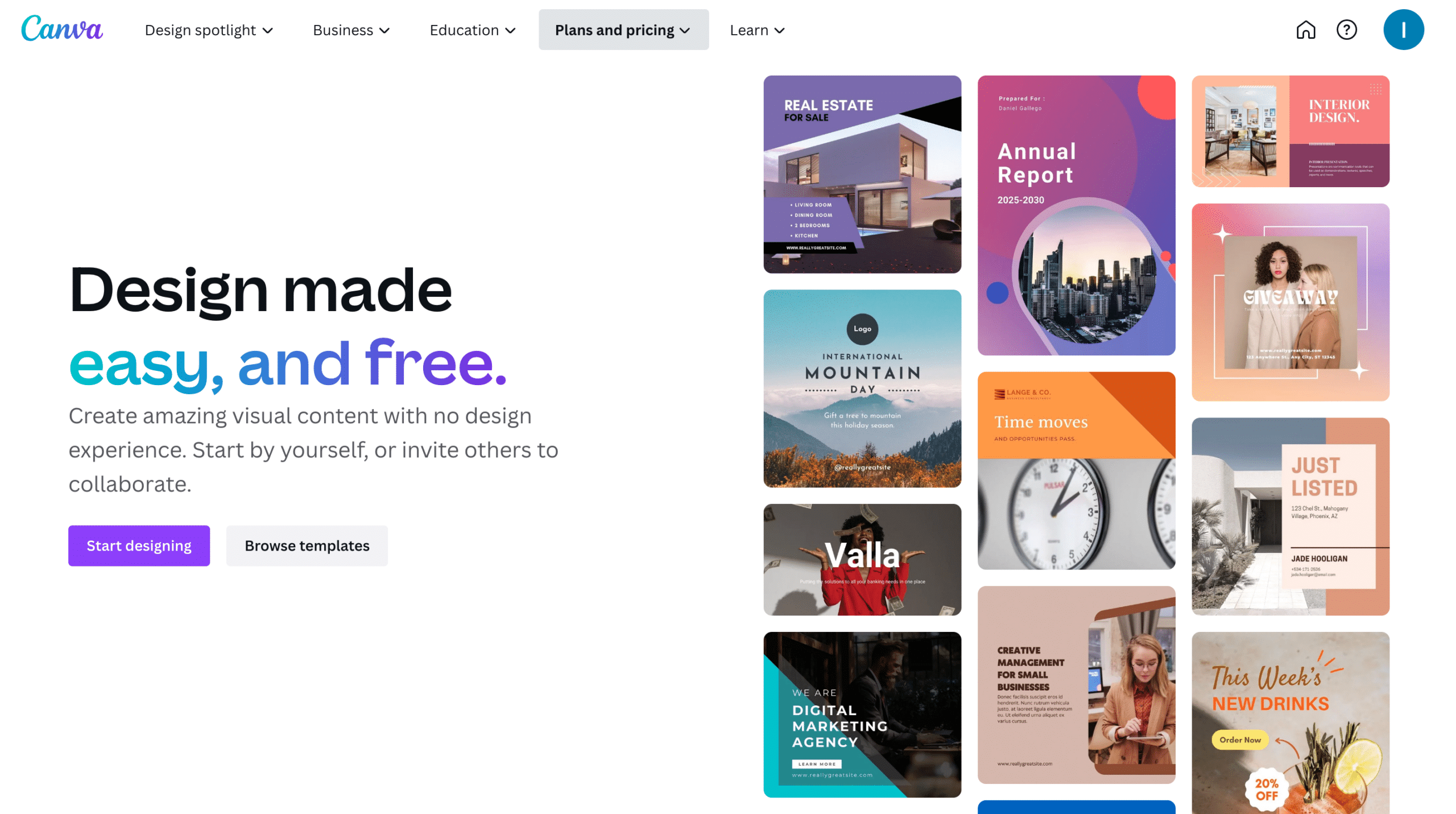
- Be Clear & Specific: Avoid ambiguity and clearly state what users can expect after clicking the CTA. For example, Canva’s website CTAs are very specific to their core offerings:
Mistake 6: Lack of Social Proof & Testimonials
Since we live in a very digital world, we often lack face-to-face human interaction. Online social proof can boost your SaaS product’s authority and reliability despite this. Here are a few ways you can execute this:
- Request Feedback: Proactively seek feedback from customers through follow-up emails, surveys, or feedback forms.
- Engage on Social Media: Encourage users to share their experiences on social media platforms and engage with them by responding to comments and reviews.
- Offer Incentives: Incentivize customers to leave reviews or submit user-generated content by offering discounts, rewards, or special access.
- Implement Review Requests: Automate review requests after a customer has used the product or service for a specific period, prompting them to share their experience.
- Create a Community: Foster a community of users where they can share their experiences, ask questions, and interact with one another.
Overall, showing social proof through reviews, feedback, communities, etc. will establish trust and drive customers to make a purchase with your business.
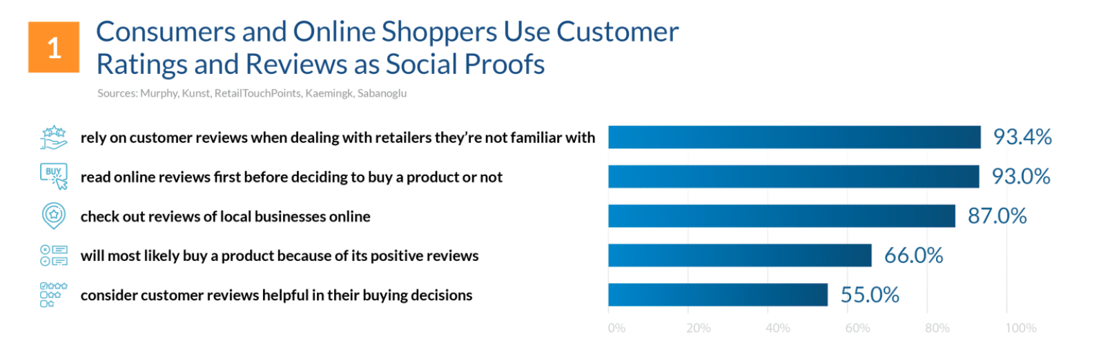
Source: FinancesOnline
Mistake 7: Slow Loading Times
When a website takes too long to load, it can lead to increased bounce rates, decreased user engagement, and ultimately, a negative impression of the brand. Additionally, search engines like Google consider page loading speed as a ranking factor in their algorithms. Websites with slow loading times are likely to rank lower in search results, resulting in reduced organic traffic and visibility.
Here are a few ways you can identify website speed issues and resolve them:
- Conduct Website Speed Tests: Use online tools like Google PageSpeed Insights, GTmetrix, or Pingdom to identify specific issues affecting the website’s loading speed.
- Optimize Images: Compress images without sacrificing quality to reduce file sizes and decrease the time it takes for images to load.
- Minimize HTTP Requests: Reduce the number of elements on the page, such as scripts, stylesheets, and external resources, to minimize HTTP requests.
- Utilize Browser Caching: Enable browser caching to store static resources locally on the user’s device, reducing the need to reload them on subsequent visits.
- Enable Gzip Compression: Enable Gzip compression on the server to reduce the size of HTML, CSS, and JavaScript files during transfer.
- Upgrade Hosting Plan: If the website is hosted on a shared server, consider upgrading to a dedicated or VPS hosting plan for improved performance.
Mistake 8: Outdated Content
Content is the backbone of any SaaS website, serving as a powerful tool to attract, engage, and convert visitors into customers. You want to maintain a competitive edge with updated and relevant content. Trends are always changing, especially within the digital landscape, so it’s imperative that you keep up with them. According to SEMrush, 42% of marketers said updating existing content has boosted their content marketing value
Here are some strategies to keep in mind when creating fresh and engaging content:
- Audience Research: Conduct thorough research to understand the needs, preferences, and challenges of your target audience, ensuring that your content resonates with them.
- Content Calendar: Create a content calendar to plan and organize content creation, ensuring a consistent flow of valuable and up-to-date articles, blog posts, and resources.
- Focus on Quality: Prioritize quality over quantity, providing well-researched and insightful content that delivers real value to users.
- Update Existing Content: Regularly update and refresh existing content to keep it relevant and accurate, demonstrating the SaaS company’s commitment to staying current.
- Use Visuals: Incorporate visuals such as infographics, images, and videos to enhance the visual appeal of the content and improve user engagement.
- Provide Solutions: Address user pain points and offer solutions through informative and problem-solving content, positioning the SaaS company as a helpful resource.
- Encourage User Interaction: Include calls-to-action that encourage user comments, feedback, and social media shares to foster engagement and community building.
Mistake 9: Inadequate Security Measures
Implementing robust security measures not only protects user data but also plays a crucial role in building trust and credibility with customers. A secure website demonstrates the SaaS company’s commitment to safeguarding user information and maintaining a safe online environment.
Implement the following robust security measures for your SaaS website:
- Use Strong Authentication: Enforce strong password policies and consider implementing multi-factor authentication to add an extra layer of security.
- Regular Security Audits: Conduct periodic security audits and vulnerability assessments to identify potential weaknesses and promptly address them.
- Frequent Software Updates: Keep all website software and plugins up to date to patch security vulnerabilities and prevent potential breaches.
- SSL Certificate: Install an SSL certificate to encrypt data transmitted between the user’s browser and the server, ensuring secure connections.
- Web Application Firewall (WAF): Implement a WAF to filter and monitor HTTP requests, protecting against various web-based attacks.
- Data Encryption: Encrypt sensitive user data both in transit and at rest to protect it from unauthorized access.
- Secure Hosting: Choose a reputable and secure web hosting provider like Hostinger that employs strong security measures and regularly monitors server security.
- Routine Backups: Perform routine data backups and store them securely to ensure data recovery in case of a security incident.
Mistake 10: Disregarding SEO Best Practices
An effective SEO strategy ensures that your SaaS website design gains maximum visibility, attracting organic traffic from users actively searching for relevant solutions. This is so important as over half of all website traffic comes from organic search. Ignoring SEO best practices can hinder the website’s discoverability, leading to missed opportunities for attracting potential customers and staying ahead of competitors.
Avoid these poor practices for your SEO strategy:
- Keyword Stuffing: Overusing keywords in an attempt to manipulate search rankings can result in low-quality and unnatural-sounding content.
- Duplicate Content: Having duplicate content on the website can lead to indexation issues and hinder the ranking potential of individual pages.
- Neglecting On-Page SEO: Ignoring on-page SEO elements, such as meta tags, header tags, and internal linking, can limit the website’s visibility in search results.
You want to make sure you’re optimizing on-page and off-page elements for better visibility:
- Keyword Research: Conduct thorough keyword research to identify relevant and high-intent keywords that align with the target audience’s search intent. Try to find long-tail keywords that are highly focused on your product/service offerings.
- On-Page Optimization: Optimize meta titles, meta descriptions, header tags, and content with relevant keywords to improve search engine visibility.
- High-Quality Content: Create valuable and engaging content that addresses user queries and provides solutions to their problems.
- Link Building: Build high-quality backlinks from reputable websites within the industry to increase the website’s authority and ranking potential.
- Local SEO: For SaaS companies with a physical presence or targeting specific locations, optimize for local SEO to attract local customers.
- User Experience: Prioritize user experience by improving website speed, navigation, and overall usability.
- Analyze and Adapt: Regularly analyze SEO performance using tools like Google Analytics and Search Console, and adjust strategies based on data insights.
Mistake 11: Not Utilizing Analytics
For your SaaS business, you want to make sure you are making data-driven decisions in order to improve your conversion rates and overall brand awareness. Keep your eyes on these key metrics for measuring your business performance:
- Website Traffic: Monitor overall website traffic, including the number of visitors, unique visitors, and traffic sources, to assess the website’s reach and popularity.
- Conversion Rates: Track conversion rates for sign-ups, free trials, or purchases to measure the effectiveness of the website’s call-to-action strategies.
- Churn Rate: Measure the churn rate, which represents the percentage of customers who cancel their subscriptions, to understand customer retention and satisfaction.
- User Engagement: Analyze user engagement metrics, such as time on site, page views per visit, and bounce rates, to assess how effectively the website keeps users interested and exploring.
- Funnel Analysis: Use funnel analysis to identify drop-off points in the conversion process and understand how users progress through the sales journey.
Mistake 12: Ignoring Customer Support
When users encounter issues or have questions about a product or service, they seek prompt assistance and reliable solutions. Ignoring customer support or making it difficult for users to find contact information can lead to frustration, decreased trust in the brand, and potential customer churn. Prioritizing customer support fosters loyalty, encourages repeat business, and enhances the overall reputation of the SaaS company.
Try to implement these best practices to enhance your customer support efforts:
- Clear & Visible Contact Information: Display contact information prominently on the website, preferably in the header, footer, or a dedicated “Contact Us” page.
- Multiple Support Channels: Offer a variety of support channels, such as live chat, email, phone, and social media, to accommodate different user preferences.
- Robust Self-Service Resources: Create a comprehensive knowledge base or FAQ section that covers common user queries and guides users through self-help options.
- Chatbots for Basic Queries: Integrate chatbots to handle routine queries and provide quick answers to frequently asked questions. This can be easily integrated into your website. For example, PandaDoc has a chatbot that immediately pops up in the corner of their website for the visitor to ask questions:
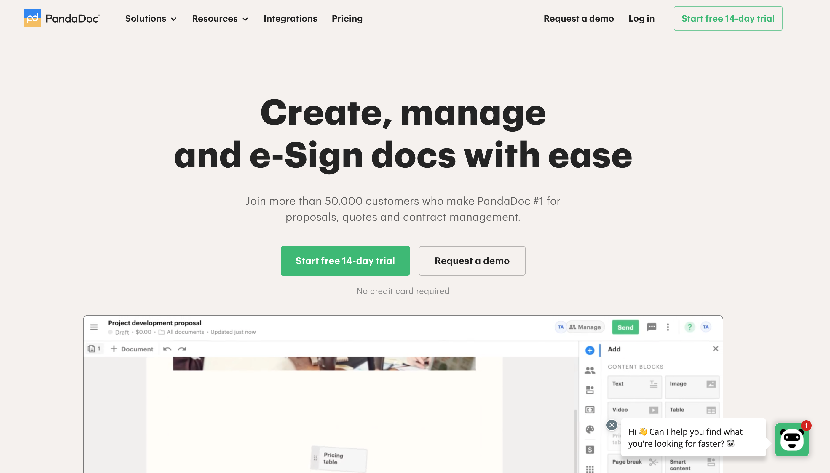
Many SaaS companies implement these chatbots as it’s a quick solution for any questions or concerns that the website isn’t answering for the visitor.
- Ticketing System: Use a ticketing system to manage and prioritize customer inquiries, ensuring that no query goes unnoticed or unresolved. Zendesk is a great platform for this.
- 24/7 Support Availability: If feasible, offer 24/7 customer support or clearly communicate support hours to set user expectations.
Mistake 13: Lack of Testing & Improvements
In order for your SaaS business to grow you need to conduct testing and gather feedback on your product. If you don’t do this, you’ll likely remain stagnant and fail to keep up with the ever-changing environment of this industry.
A/B testing and surveys are only half of the process. If you ignore the results of those efforts, your research will be a waste. Identify the weak points of your business and figure out how you can make the customer experience better.
SaaS Website Design Key Takeaways
The good news is that for each mistake, there are actionable solutions to improve and optimize your SaaS website. By crafting a compelling value proposition, enhancing website navigation, and implementing mobile responsiveness, SaaS companies can create a seamless and engaging user experience. Incorporating social proof, optimizing loading times, and embracing SEO best practices can boost website visibility and credibility.
If you need another perspective on your company’s marketing strategy, Insivia specializes in designing effective SaaS websites that are built with the purpose to help you drive conversions.

Written by: Andy Halko, CEO, Creator of BuyerTwin, and Author of Buyer-Centric Operating System and The Omniscient Buyer
For 22+ years, I’ve driven a single truth into every founder and team I work with: no company grows without an intimate, almost obsessive understanding of its buyer.
My work centers on the psychology behind decisions—what buyers trust, fear, believe, and ignore. I teach organizations to abandon internal bias, step into the buyer’s world, and build everything from that perspective outward.
I write, speak, and build tools like BuyerTwin to help companies hardwire buyer understanding into their daily operations—because the greatest competitive advantage isn’t product, brand, or funding. It’s how deeply you understand the humans you serve.