SaaS Website Design Consistency for Conversion
There is a fine line when it comes to introducing change. For the best results, change must be implemented gradually and strategically. As the saying goes, “bend consistency, don’t break it.”
As for design, a good eye and a laundry list of unwritten laws guide designers in their work and they most often lend themselves to one word–consistency.
In the SaaS industry, consistency is absolutely key. Consistent design helps maintain customer loyalty and build trust between customers and businesses. By utilizing consistent visual elements throughout their website, users can easily recognize the brand and navigate to where they need to go. A well-executed design will ensure that no matter where a user is on the website, they will be able to find their way back home.
CTA Styling and Placement
Positioning
A Call To Action (CTA) is an element of web design that encourages a user to take a desired action. It could be as simple as clicking on a button or filling out a form, and it helps guide users through the website. A well-placed CTA can increase conversions by inviting users to interact with your product or service.
CTA placement is critical in SaaS web design consistency. A CTA should not be placed randomly on a page, as this can be overwhelming and confusing for the user. Instead, it should be placed in a prominent position that leads visitors to take the desired action. This could be the top of a page, the bottom of a particular section, the sidebar, or a floating panel that moves with the user as they scroll. It can also be helpful to include multiple CTAs throughout the page such as within relevant content and above and below key visuals.

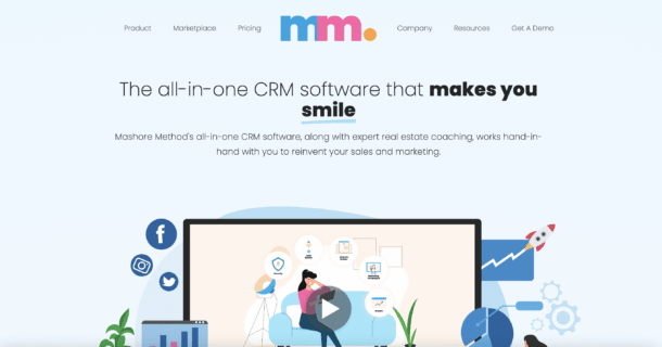
This example shows effective placement of a CTA. It resides at the end of the section and is brightly colored with adequate color contrast.
CTA Styling and Color
CTA styling and color are essential to SaaS web design consistency. The color of the CTA should be consistent with the overall brand identity, as this will help users recognize it quickly. Additionally, CTAs should stand out from other elements on the page; a bold, bright color will draw attention to the CTA and encourage users to take action.
When picking colors for your CTA, consider how various hues can elicit different emotions from users. For example, blue is often associated with trustworthiness, while yellow or orange can evoke feelings of joy or excitement. Choosing an appropriate color for your CTA is important in order to create a strong connection between customers and your product or service.
In addition to choosing the right color, CTAs should also have consistent styling across all pages of your website or app. This means using the same font type, size, weight and stylistic elements such as drop shadows, borders or gradients. Using consistent styling in your SaaS design helps create a unified experience for users; they know that when they see a certain style of CTA, it means an action is required of them.
Ultimately, CTAs are essential tools for guiding users through your SaaS business website and increasing engagement with customers. They can help drive conversions when used strategically and creatively, so it’s important to place them carefully within page layouts for maximum effect.
Consistency and Predictability for a Better User Experience
Watch episode #8 of our SaaS Website Conversion Show all about increasing conversion for software websites.
Page Architecture
Typographic Hierarchy
Traditional typographic scales exist to help designers create SaaS web designs that are consistent and unified. These scales are based on the size of the body text, which is usually set at 16px or larger for legibility. From there, font sizes increase in increments of two or four pixels for headings and other elements such as lists and quotes.
Typographic hierarchy also encompasses the use of font weights and styles. For SaaS web design consistency, it’s important to stick with one typeface throughout the site, using bolder or lighter weights for emphasis. Additionally, italicizing can help create visual interest and differentiate sections of text from each other.

In this example, there are three levels of typographical hierarchy. It has 3 levels of font weight and font size, two different colors and clear differentiation between headers and paragraph text. This increases readability and scannability.
F-Pattern Typography
F-pattern typography is an effective way to make SaaS web design consistent and scannable for users. This type of layout arranges text in a predictable, eye-catching format that encourages users to scan the page quickly and efficiently, making it easier for them to find what they are looking for. F-patterns allow designers to highlight important information by utilizing font sizes, weight and style variations, as well as whitespace. By strategically placing elements on the page according to the F-pattern structure, SaaS web pages can be made more user friendly while still maintaining visual consistency across the entire website or app.

In this example, the F shape is clearly visible in the typography. A small, “eyebrow,” header, followed by a main header, followed by three list items, all slightly shorter than the previous item.
Whitespace
Whitespace (also known as negative space) is an important component of SaaS web design consistency. It can be used to create focus, structure, and legibility for users by creating a separation between elements on a page. The use of whitespace helps to simplify a page and make it less intimidating for users.
When using whitespace, it’s important to make sure the amount of space is appropriate for the size of each element and its purpose. For example, an element that requires more emphasis should have more white space around it than one with less importance. Additionally, SaaS web design consistency can be achieved by maintaining a consistent margin or padding size throughout the website or app.
Consistent SaaS web design is key for creating a user-friendly experience that encourages engagement and drives conversions. By focusing on page architecture, typographic hierarchy and whitespace, SaaS businesses can make sure their website or app looks professional and cohesive, while still being easy to use. With these principles in mind, SaaS web design teams can create designs that are beautiful, efficient, and consistent.
Color Theory
When it comes to websites in particular, color theory plays an essential role in SaaS web design consistency. Color decisions or combinations can dictate how the user interacts with a website and can make a huge impact on the overall user experience.
In addition to evoking desired emotions, SaaS web design consistency is also impacted by color contrast. Users prefer high contrast websites as they are easier to read and navigate, so SaaS designers should use contrasting colors for important elements like text, headings and CTAs. When there is enough contrast between page elements, users are able to scan through information more quickly and easily which increases engagement.
Example: Mashore Method
Mashore Method is a fantastic example of consistency in color theory. SaaS sites tend to gravitate toward a hyper-clean, usually white background with blue accent colors, but Mashore takes a unique approach for developing their visual brand.
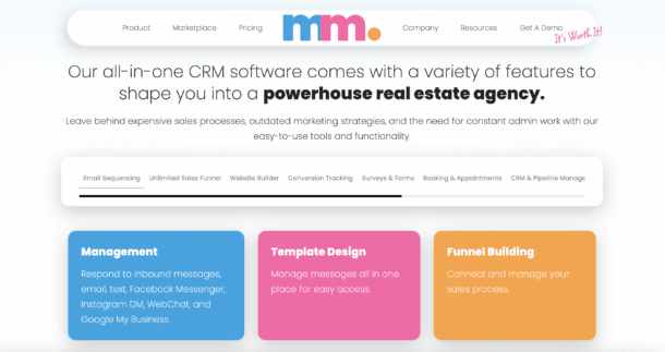
Mashore Method maintains that hyper-clean appeal, but captivates viewership through their exclusive color palette.
Accessibility Through Color Contrast
When it comes to SaaS web design consistency, color contrast plays an essential role. High contrast websites are easier for users to read and navigate, so SaaS designers should use contrasting colors for important elements like text, headings and CTAs. When there is enough contrast between page elements, users can scan through information more quickly and easily which increases engagement. Additionally, high-contrast color combinations help ensure accessibility standards are met by making sure those with visual impairments can still access the content on a website or app. By using strong color contrasts in SaaS web design teams can create designs that are beautiful, efficient, and consistent while also ensuring their products meet accessibility requirements.
Furthermore, SaaS businesses should keep accessibility in mind when choosing a color palette for their website or app. Color combinations should be mindful of people who have difficulty seeing certain shades or hues, including those affected by colorblindness. It’s important for SaaS businesses to consider all users when creating their web designs and make sure that everyone has access to their product or service regardless of any disabilities they may have.
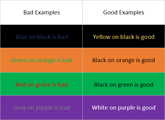
This example shows examples of bad contrast errors on the left and good contrast blending on the right.
When used strategically, color can have a powerful impact on SaaS web design consistency and help create an engaging experience for users. SaaS businesses should take into consideration not just the emotions that certain colors evoke but also accessibility needs when deciding on a color palette for their website or app. By doing this they can ensure that their design remains consistent across all platforms while also providing an enjoyable user experience for every customer who visits their site.
Ease of Navigation
Navigation is an important part of SaaS web design consistency as it allows users to easily and efficiently find the information or services that they need. A well-designed SaaS website should be intuitive to use, with easy-to-understand navigation menus and clear instructions on how to access certain pages or features.
When designing SaaS products for mobile devices, designers must keep in mind that users will most likely be using their fingertips instead of a mouse for navigation purposes. As such, SaaS web designs should include larger clickable areas around navigation elements like links and CTA buttons so that they are easier for users to tap on with their fingers while on the go. In addition, SaaS websites should take into account how data connection speeds may affect loading times when creating navigation flows so as not to frustrate users who have slower connections.
One study showed that after websites improved the ease of navigation, conversions increased by 18.5%.
Mega Menus
Mega menus are a popular UI/UX element used in SaaS web design to make navigation easier for users. Not only do they provide an efficient way of organizing information, but they also help SaaS businesses ensure their website or app is accessible to all users. By using larger clickable areas and including clear instructions on how to access certain pages or features, SaaS designers can create mega menus that are easy to navigate regardless of device type or data connection speed. Additionally, websites should take into consideration contrast when creating mega menus as this helps ensure that those with visual impairments can still access the content on the page. With strategic use of colors and thoughtful design elements, SaaS businesses can create mega menu user interfaces that are both aesthetically pleasing and highly accessible.
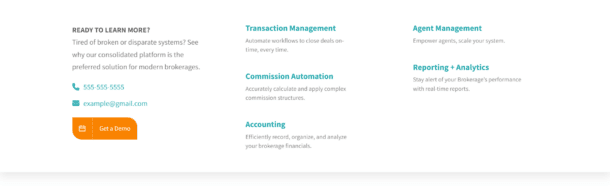
This example shows a simple way of structuring a mega menu which has elements of whitespace, CTAs and typographical hierarchy built into it.
Overall, SaaS businesses should strive for simplicity when designing navigation menus for their website or app in order to ensure SaaS web design consistency. Properly organized navigation menus make browsing easier for customers and decrease confusion by making it clear what options are available at any given time. By focusing on user convenience, SaaS designers can create an enjoyable user experience which will encourage them to stay longer and explore more of what your SaaS business has to offer.
Key Takeaways
Web design is key to ensuring that your website stands out from the competition, creates an enjoyable user experience, and clearly communicates its value. By creating visually appealing designs and strategically placed elements on the page, you can increase click-through rates, generate more leads, and encourage users to engage with your product or service. With the right web design strategy in place, your SaaS business can achieve optimal results.
SaaS businesses should be aware of the importance of web design consistency in order to create an engaging user experience. By taking into consideration color, typographical arrangement, accessibility needs and ease of navigation when designing a SaaS website, SaaS businesses can ensure that their products are both aesthetically pleasing and highly accessible across all platforms.

Written by: Tony Zayas, Chief Revenue Officer
In my role as Chief Revenue Officer at Insivia, I help SaaS and technology companies break through growth ceilings by aligning their marketing, sales, and positioning around one central truth: buyers drive everything.
I lead our go-to-market strategy and revenue operations, working with founders and teams to sharpen their message, accelerate demand, and remove friction across the entire buyer journey.
With years of experience collaborating with fast-growth companies, I focus on turning deep buyer understanding into predictable, scalable revenue—because real growth happens when every motion reflects what the buyer actually needs, expects, and believes.