A screenshot is not an explanation.
Show how your offer works with visuals buyers can interpret.
Do not hide the product. Do not dump the interface on the page and make a stranger decode it. Show the part that answers the buyer’s question—and make the meaning unmistakable.
Your buyer should not need product training to understand the page.
Show the Answer—not the Entire Interface
Software websites make two expensive mistakes. Some barely show the product. Others paste a full screenshot onto the page and expect a stranger to know which control, chart or workflow matters.
The first asks buyers to believe in something they cannot inspect. The second gives them an interface and the job of figuring out why it matters.
Both increase uncertainty. A buyer who cannot connect the claim to something concrete must either keep working, take your word for it or leave. Most will not reward the company for making the explanation harder.
The job of a website visual is to help the buyer understand, judge or remember one important idea. If the buyer has to search the visual for the point, the visual is unfinished.
This does not mean every image must explain the entire offer. It means every consequential visual needs a clear job: orient the buyer, show a mechanism, make an outcome tangible, demonstrate fit or provide evidence.
Your team already knows the interface. Your buyer does not.
Do Not Assume Buyers Know Where to Look
Your team knows the navigation, terminology, data and workflows because they use the product. That inside knowledge makes a crowded screenshot look clearer to your team than it will to a new buyer.
The buyer does not arrive with that context. They are trying to answer simpler questions:
Orientation
What am I looking at?
Name the screen, object, workflow or result in language the buyer recognizes.
Relevance
Why does this matter to me?
Connect the visual to the buyer’s pain, responsibility, desired progress or decision.
Mechanism
How does the value happen?
Show the step, relationship or change that makes the claim believable.
Judgment
What can I conclude from this?
Give enough context to evaluate the point without claiming more than the visual proves.
A screenshot can be technically accurate and still fail all four questions. Accuracy is the minimum. Interpretation is the goal.
Start with the buyer question. Then choose the visual.
Use the Format That Makes the Answer Easiest to Understand
| Buyer question | Useful format | What to emphasize | Common failure |
|---|---|---|---|
| What would I actually use? | Real product screen or short demonstration | The recognizable environment and consequential task | Hiding the product behind abstract illustration |
| How does one task work? | Focused crop, annotation or staged sequence | The action, response and result | Showing every control on the screen |
| How does work move? | Workflow, timeline or scroll-led walkthrough | Roles, handoffs, sequence and decision points | Drawing a decorative process with no operational meaning |
| What would our team receive? | Representative deliverable, report or output excerpt | The information the buyer can inspect and use | Showing a generic mockup that looks like evidence |
| What is different? | Honest comparison, before-and-after or annotated contrast | The specific change and its consequence | Using a chart whose design exaggerates the difference |
| Is the claim credible? | Source-labeled chart, sample, demonstration or case artifact | Context, source, conditions and limits | Presenting visual polish as proof |
Choose the format only after you know the buyer’s question. A polished diagram that answers the wrong question is still the wrong visual. A simple crop can work when it makes the answer clear.
A full screenshot is not automatically useful.
Show Only What the Buyer Needs to Understand
Both graphics use the same fictional RelayOps product and the same request. The first is a realistic application screen with navigation, filters, records and activity. The second is a website graphic created from that product state to explain one point: ownership changes when Operations accepts the request.
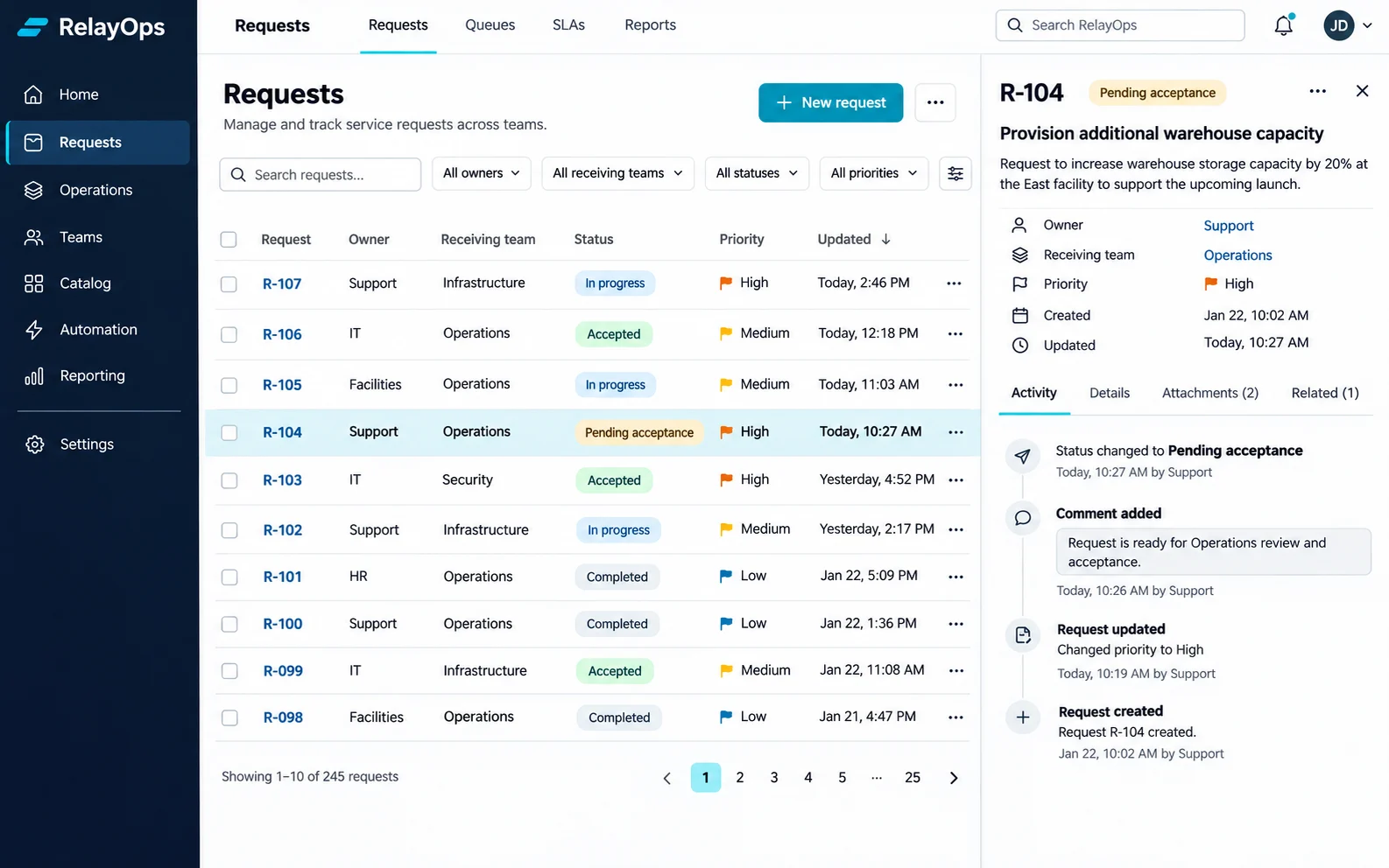
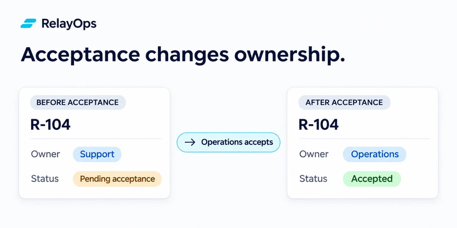
Remove information that does not help answer the buyer’s current question. Keep the detail they need to understand and trust the answer.
That distinction matters. Simplification is not permission to invent capabilities, redesign the product into something it is not or turn a concept into fake evidence. The visual must remain truthful about what exists and clear about what is representative.
Choose the amount of product detail the buyer needs now.
Choose a Real Screenshot, Focused Crop or Simplified Visual
Show the real interface
When inspection builds confidence
Use the real product when visual quality, interaction detail, data structure or working capability is part of what the buyer must judge. Crop it when the full screen distracts from the question.
Focus or annotate
When one relationship matters
Use a real crop, highlight, caption or staged sequence when buyers need to understand one control, workflow or result without learning the whole interface.
Use a representative visual
When the concept matters first
Use a simplified diagram or representative product graphic when the buyer needs the model before the detail. Label it honestly; do not let an illustration impersonate a live product screen.
If the interface is weak, explain the product honestly without pretending it looks better than it does.
If the current product experience is not strong enough to feature, the company has a real decision to make. Use honest, simplified representations to explain the mechanism, show focused excerpts that are credible and create a route to inspect the actual product later. Do not create a fictional interface that sets an expectation the product cannot meet.
Make the headline, visual and caption explain the same point.
Use Copy to Explain What the Visual Shows
Headline
Say what the visual shows.
Name the product action, workflow, result or comparison directly. Do not make the buyer interpret a clever headline before interpreting the image.
Visual
Show the exact part that explains the point.
Crop, highlight or simplify the image so the important action or result is the first thing the buyer notices.
Caption
Explain what the buyer should notice.
State what changed, why it matters and any context the image cannot communicate by itself.
Text alternative
Describe the same information in text.
Write useful alternative text. For a complex chart or diagram, also explain the important information in the surrounding page copy.
The buyer should reach the same conclusion from the headline, the image and the caption. If those elements communicate different ideas, revise the section. If the image adds no understanding, remove it.
Decide what the visual must explain before designing it.
Use This Visual Brief for Every Important Image
- Name the buyer question.
Write the exact question the visual must help answer. “Make this section engaging” is not a buyer question. - State the intended understanding.
Finish this sentence: After seeing this, the buyer should understand that… - Identify the verified source.
Name the real screen, workflow, deliverable, data source or operating fact the visual represents. - Choose the minimum useful format.
Decide whether the buyer needs a real screen, crop, annotation, sequence, diagram, comparison or sample. - Define what receives emphasis.
Specify the one relationship, change, control, output or conclusion the buyer should notice first. - Write the caption and text alternative.
Explain the takeaway, important context and any limit that affects interpretation. - Run the honesty check.
Separate observed product truth from representative explanation. Label simplified, hypothetical or illustrative material. - Test interpretation.
Show the section without explaining it. Ask what the person thinks it means, what they noticed first and what question remains.
Use a sequence when the buyer needs to understand a sequence.
AgileLaw Explained the Product One Step at a Time
Insivia client · Project decision, not a measured performance claim
Buyers needed to understand the flow of use without decoding the entire interface.
AgileLaw’s product supports deposition work. A full product screen could show that the software exists, but it would ask an unfamiliar visitor to understand too many controls and too much context at once.
The homepage direction used a progressive, interactive explanation: move through stages, pair focused product views with short text and let each step answer the next question. The buyer sees how use develops over time instead of receiving one dense screenshot.
- Buyer questionHow would this fit into the work of a deposition?
- Visual decisionShow the progression of use with focused screens and explanations.
- Why it is clearerEach view has one job, and the sequence builds context before adding more detail.
- What it does not claimThe interaction explains the product; it is not proof of a customer outcome or adoption result.
Animation was not the strategy. The strategy was to break a multi-step product experience into a sequence buyers could understand one step at a time.
Audit comprehension—not image count.
Run the Buyer-Interpretation Visual Audit
- Inventory the consequential visuals.
Ignore decoration at first. Find the screens, diagrams, charts, comparisons, samples and process graphics carrying part of the argument. - Name the buyer question for each one.
If the team cannot name the question, the visual may exist for internal preference instead of buyer understanding. - Ask what prior knowledge the visual assumes.
List the terms, controls, relationships and context an unfamiliar buyer would need to interpret it. - Remove the detective work.
Crop, annotate, sequence, relabel or replace anything that forces the buyer to hunt for the point. - Check truthfulness.
Confirm that screens are real, data is sourced, comparisons are fair and representative visuals are labeled. - Check copy alignment.
The headline, visual and caption should support the same conclusion without repeating one another mechanically. - Check accessibility.
Provide useful text alternatives, readable labels, sufficient contrast and a detailed description for complex information when necessary. - Test with someone who lacks inside knowledge.
Ask what they think the visual means before explaining the intent. Record the gap and revise.
Use research to improve interpretation—not justify visual clutter.
Research and Related Guidance
- Cambridge Handbook of Multimedia Learning: Multimedia Principle — research foundation for combining words and pictures in instructional communication.
- Richard Mayer: Designing Instruction for Constructivist Learning — supports coordinating relevant words and pictures while limiting extraneous material.
- W3C: Complex Images — guidance for short and detailed text alternatives for charts, diagrams and other complex visuals.
- W3C: Easy Checks for Web Accessibility — practical checks for image alternatives and other accessibility fundamentals.
- Build Product and Solution Pages Around Buyer Questions — connects visual decisions to the sequence of questions buyers need answered.
- Use Proof and Trust Signals to Resolve Buyer Doubt — distinguishes product explanation from evidence that supports a claim.
The visual brief, format-selection table and buyer-interpretation audit are Insivia practitioner methods. They are planning tools, not claims that one visual format universally improves conversion.