Your org chart is not intuitive.
Design navigation around how buyers think.
Buyers should not have to understand your departments, product lines or internal terminology before knowing where to click.
Use navigation to create comprehension, confidence and exploration—not to display the company’s filing system.
Familiar to your team is not intuitive to your buyer.
Internal Logic Is Not Intuitive
Your team has one major blind spot: it already knows the structure.
Your team has heard the product names for years. It knows which department owns each capability and why one solution sits inside another. That familiarity makes the navigation feel intuitive.
It is not intuitive. Your team has memorized it. A buyer has not.
A buyer arrives with incomplete knowledge and a task. The buyer may know the problem but not the category, or know the category but not your terminology. The buyer may also be comparing providers and looking for one requirement that could remove you from the shortlist.
Good navigation lets the buyer predict what each choice will reveal without first learning how your company is organized.
| The company asks | The buyer is trying to do |
|---|---|
| Where does this offering belong in our portfolio? | Which path sounds like my problem or desired outcome? |
| Which team owns this page? | Where can I get the answer I need? |
| How do we give every service equal visibility? | Which choices matter to my situation? |
| What terminology is technically correct? | Which label can I understand immediately? |
| How do we fit everything into the menu? | What should I explore next? |
Build the navigation around the questions in the right-hand column.
A vague label charges the buyer an uncertainty tax.
Every Click Is a Prediction
A navigation label makes a promise.
Before clicking, the buyer predicts what will be behind it. A clear label tells the buyer what is likely to be there. A vague label makes the buyer guess whether the click will be worth it.
That is why labels such as “Solutions,” “Platform” and “Resources” can fail. Those labels are not automatically wrong, but each is broad enough to mean several things. The menu must add descriptions, subcategories or supporting structure that makes the destination predictable.
This is not a place to be creative for the sake of personality. Clever navigation copy asks the buyer to solve a riddle before receiving information.
Intuitive beats inventive.
The Label Promise Test
For every important label, answer five questions:
- What would an unfamiliar buyer reasonably expect behind it?
- Does the destination deliver that answer immediately?
- What company or category knowledge does the label assume?
- Could another label in the navigation reasonably mean the same thing?
- What realistic task could test whether buyers choose it?
If your team cannot agree on what a buyer should expect, the label is not ready.
The homepage is not always page one.
Buyers Do Not Start Where Your Sitemap Starts
Search, ads, referrals, AI answers and shared links send visitors into the middle of the website.
Someone may land on a detailed solution page, decide the content is relevant and then visit the homepage to understand the company at 30,000 feet. Another buyer may begin on the homepage and jump directly to an industry page. An evaluator may bypass both and look for security, implementation or proof.
Every important entry page must help buyers understand where they are and what to do next. Do not assume everyone starts on the homepage or follows the same path.
Each major page should make four things clear:
- where the buyer is;
- what the page is there to explain;
- what broader offer or category it belongs to;
- and where the buyer can go for the next useful answer.
Breadcrumbs, descriptive headings, relevant links and consistent navigation are not decoration. They tell buyers where they are and help them get to the next answer.
Mobile Navigation Forces Prioritization
A desktop mega menu can hide weak prioritization behind available space. Mobile removes that excuse.
- Do not turn the entire desktop sitemap into a long accordion.
- Preserve short descriptions when a broad label needs context.
- Keep important alternate routes visible without creating five nested levels.
- Make the current location and the path back obvious.
- Test realistic buyer tasks on mobile—not merely whether the menu opens.
Do not copy the desktop menu onto mobile. Keep the choices buyers need and make those choices easy to understand.
More space should create more understanding.
A Mega Menu Should Tell a Story Before the Click
A mega menu is not a solution to bad architecture. More space can expose more confusion.
When the categories make sense, a mega menu can explain the offer before the buyer clicks. It can show how problems, outcomes, capabilities, audiences and proof fit together.
The number of links is not the success measure. The buyer's ability to understand the choices and confidently select a route is.
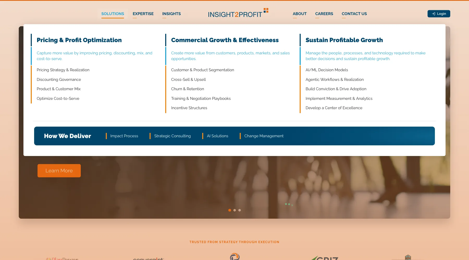
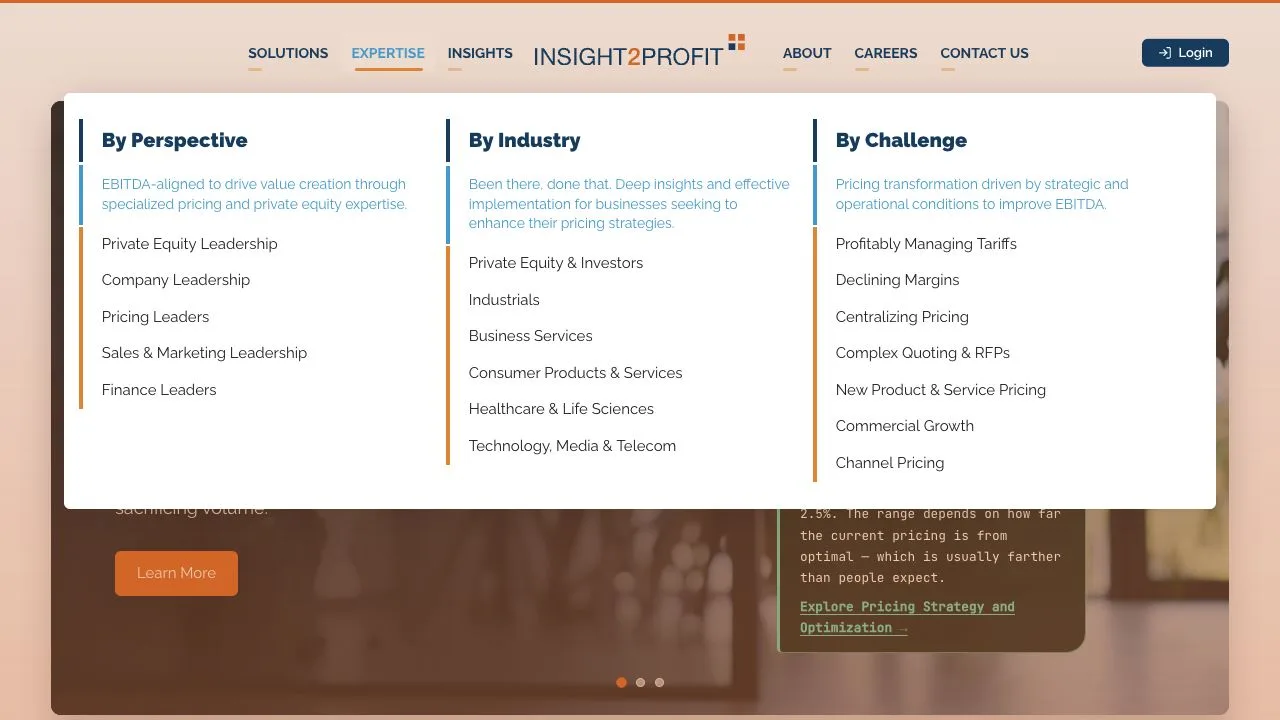
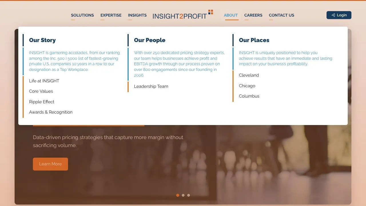
One offer. Several buyer-recognizable ways in.
Worked Example: INSIGHT2PROFIT Uses Navigation to Explain the Offer
INSIGHT2PROFIT has a complex story: pricing, commercial growth, sustained implementation, different leadership perspectives, multiple industries and several buyer challenges.
The easy internal answer would have been a menu organized around consulting services. That would force buyers to learn the firm's portfolio before finding a useful path.
Insivia client · INSIGHT2PROFIT
Start with what buyers recognize.
The finished navigation gives buyers several clear ways into one company story. Buyers do not have to understand the consulting portfolio first.
Explore the live navigationInstead, Insivia made three architecture decisions:
- Lead with outcomes. The primary solution paths start with what buyers are trying to improve.
- Offer several ways to self-identify. Buyers can enter through their leadership perspective, industry context, or immediate challenge.
- Keep one company story underneath the routes. The paths change how buyers enter the explanation—not the underlying offer.
The slideshow above shows the finished menus. The important lesson is the decision behind those menus: a complex offer becomes easier to explore when buyers can start with a problem, outcome or situation they already recognize.
This is real Insivia client work. We are showing the navigation decision, not claiming the menu produced a measured conversion result. The lesson is simple: one company story, with several clear ways in for buyers.
Start with the task, not the boxes.
Build a Buyer Route Map Before Polishing the Menu
Do not start by dragging boxes around a sitemap.
Choose one important buyer task and complete this record:
| Field | What to document |
|---|---|
| Buyer and starting point | Buyer role or situation, likely entry point and what the buyer already understands. |
| Question or task | The answer the buyer needs or the progress the buyer is trying to make. |
| Recognizable cue | The plain-language label, description or page context the buyer is likely to notice. |
| What the page must do | What the page must help the buyer understand, judge or decide. |
| Another way in | Another reasonable way the buyer might look for the same answer. |
| Next useful answer | The question likely to follow if the destination succeeds. |
| What we know | What buyers have shown or said, what the data suggests, and what your team is only assuming. |
| What would change our minds | What result would make your team change the label, group or route. |
Repeat the exercise for the most important buyer tasks. Use the repeated patterns to shape the navigation. Keep an internal category when it also makes sense to buyers; buyer-centric does not mean changing things just to be different.
Your team already knows where everything is.
Test the Structure Before You Defend It
You cannot test the navigation with the people who designed it. Those people already know where every link goes.
Test the problem you actually need to solve:
- Card sorting shows how buyers group ideas and what buyers call those groups.
- Tree testing shows whether buyers can find the right page from labels alone, before the visual design affects the choice.
- Task-based navigation tests show where buyers click first, where buyers get lost and whether buyers feel confident in the choice.
- Search and behavioral data can show where a problem may exist, but it usually cannot tell you why buyers struggled.
A simple findability test
Give a representative buyer a realistic task without naming the navigation label you expect the buyer to choose:
“Your company is losing margin because discounting varies across the sales team. Where would you go to understand whether this company addresses that problem?”
Record:
- the first route selected;
- what the buyer expected behind the selected label;
- whether the buyer reached the answer directly;
- where the buyer backtracked;
- how confident the buyer felt before clicking;
- and what finding would justify changing the structure.
Do not ask, “Does this menu make sense?” Polite agreement is not findability.
Link to the next question—not merely another page.
Use Internal Links to Continue the Buyer’s Thinking
Cross-linking is not an SEO exercise with a buyer benefit added later.
A link inside the page should answer the buyer's next likely question. A page about an outcome can link to how it works. A page about how it works can link to requirements, proof or an audience-specific example. A case story can link back to the capability it proves.
Good internal links:
- use descriptive anchor text;
- appear where the next question naturally arises;
- connect the general explanation to the details buyers need later;
- and provide alternate access to important content.
Repeating the global navigation at the bottom of every section is not a cross-link strategy.
Make the structure earn the word intuitive.
The Buyer-Centric Architecture Checklist
- Can an unfamiliar buyer understand the main choices without learning internal terminology?
- Does every primary navigation item help buyers understand the company or move forward?
- Can buyers predict the destination before clicking?
- Are broad labels supported by useful descriptions and hierarchy?
- Does the structure work from important subpage entry points?
- Do role, industry and challenge routes contain genuinely different context?
- Does the mega menu teach a coherent story rather than expose an inventory?
- Can important answers be reached in more than one reasonable way?
- Do contextual links answer likely next questions?
- Has your team tested the navigation with people who did not create it?
- Have you clearly separated buyer evidence, data signals and internal assumptions?
- Have you documented what result would make you change each important decision?
Turn buyer thinking into documented decisions.
Use the Planning Playbook to Document the Decisions
This guide explains how buyers find and understand their options. The Plan My Buyer-Centric Website playbook helps your team define where buyers start, rank buyer questions, decide what each page must do and document why each page should exist.
Use both:
- Use the playbook to decide what responsibilities the website must fulfill.
- Use the Buyer Route Map and Label Promise Test to decide how buyers will recognize and reach the right answers.
- Test important routes before treating internal agreement as proof.
Leave With One Tested Buyer Route
Do not finish this page by scheduling another sitemap debate.
- Choose one high-value buyer task.
- Document the buyer's starting point and the answer the buyer needs.
- Map the current route and one proposed alternative.
- Run the Label Promise Test on every important choice.
- Test the route with five representative people who did not design it.
- Record what evidence would make your team reverse the decision.
Your website does not become intuitive because your team finally stopped debating it.
It becomes intuitive when buyers can understand the choices, predict where each choice leads and move forward without first learning how your company thinks.
Evidence informs the method.
Sources
- Pirolli and Card: Information Foraging in Information Access Environments
- Nielsen Norman Group: Tree Testing
- W3C: Understanding Consistent Navigation
- W3C: Understanding Multiple Ways
- Google Search Central: Sitelinks and Logical Site Structure
- Google Search Central: Crawlable Links and Descriptive Anchor Text